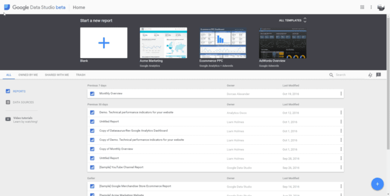
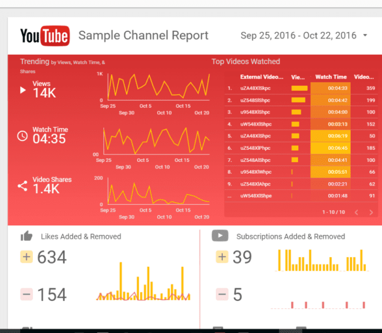
If you’re looking for a business intelligence tool that that can speedily create strong and seamless dashboards from multiple Google data sources, then Data Studio is the one for you. The tool launched back in May 2016 and since then has become a hit with small and medium businesses alike. Since the official unveiling, Data Studio has made a huge leap of progress in terms of its functionality options. Like any software tool, there will still be the odd bug and limitation, but issues are usually fixed in a speedy way as the Google team work hard to make improvements.
As a business owner, you might not have branched out to explore the realms of Data Studio, which is understandable as there is seemingly a lot to get your head around. With useful video tutorials and guidance from the official Google Data Studio help website, you can master the art of everything you need to know relatively quickly.
Checkout our Free Premade Templates
Check out our premade templates – Adwords Free Data Studio Template, and Google Analytics Data Studio Template.
What’s So Great About Data Studio?
Data Studio is a great way to integrate data from a number of different sources for analysis and reporting. You can share your dashboards much like you would do with Google Drive files, filter through data at the report or chart level and brand certain dashboards to your business. It’s also a completely free tool, which is a huge advantage when you compare it to other competitors on the market.
When you step out to use Data Studio for the first time, it might be a slight culture shock, simply because it’s a very visual way of viewing your data. The interactivity of your marketing information is astounding, but you will soon get used to it. You can really delve deep into your campaign and website performances by implementing all of the correct tools in the right way. Don’t be afraid to explore these new realms and gain more of an insight into what’s actually going on with your business. By using this visualisation tool, you can connect to other products that are already in your suite already, as well as using the quick and easy drag and drop interface. The possibilities are continually growing as well alongside the clever and quick integrations with other Google products.
How Do You Get On Board?
Follow some of these useful stages to build, visualize, create and share your reports and dashboards in a much cleaner and simpler way. If you want to get the most out of Google Data Studio then look no further.
Part A: Start connecting your data sources
-You can link to your Google Analytics account to get the most out of Google Data Studio
-Make sure you give your data a good clean up before heading onto the next part too.
Part B: Begin the process of visualising your data
-Fill your blank canvas with attractive charts that tell the story you want to share with your audience; collaborate on projects too if you like
Part C: Get sharing your project
-Share your finished charts with your peers and clients; don’t miss anybody important out from this stage.
Top Tips
Check out some of these ten super useful tips to get the most out of Data Studio:
1.) Get It Right First Time
Ensure that you are asking the right kind of questions from the get go. The input will be much more valuable and your project will be completed in a speedy manner with greater accuracy.
2.) Use the Template Gallery
By looking at examples and practising will give you an extra boost of confidence when it comes to improving your skills.
3.) Organize Your Pages
You can easily add multiple pages to your dashboard or duplicate a page if you need to. Similarly, you should name your pages so that it’s super clear what’s going on with each one.
4.) Sort Your Filters
The filter controls will soon be your best friend, found at the top right hand corner of your canvas. Dimensions, metrics and styling options are some of the types of filter you can choose, so see what works for you.
5.) Group Your Objects
By grouping a handful of objects on the page at once you will be able to use a filter control to apply to one or a few charts on your page.
6.) Add Segments
You apply segments to all of your visualizations, which is a handy thing to do. Be careful that your segments aren’t’ affecting your sampling by reading up on Google’s official advice.
7.) Get Savvy With Shortcuts
You would be lost without some of these savvy shortcuts: Group = Ctrl+G, Ungroup = Ctrl+Shift+G and Refresh Data = Ctrl+Shift+E.
8.) Diversity is Key (colors and charts)
Different colors and diverse charts are so much easier on the eye, so they can be used to show the most important visualizations on your page.
9.) Use Google Analytics
By adding a Google analytics tracking code you can see the activity on one or more reports which is very handy.
10.) Make the Most of Google Sheets
Make sure you try out Google Sheets as one of your data connectors, because they can bring a huge amount of value to your reporting efforts.
What’s the Verdict?
Much like any new piece of software for businesses and marketers, there will always be advantages and disadvantages to explore, but it could be said that the strengths certainly outweigh the weaknesses. One of the more positive elements is that there is an increasing list of bespoke Google and database connectors and along with dynamic controls that allow views to constantly change what they’re viewing at that moment in time. There are a tonne of customizable themes for your individual branding, as well as a custom fields feature which allows you to create your own dimensions and metrics. One of the most prominent features is also the unlimited reports and data sources that you have at your fingertips.
On the other hand, the Google Data Studio functions aren’t yet as advanced as those from other platforms such as BigQuery. There are also limited connectors and no rich media as of yet, but Google is constantly improving the tool as each month goes by. Hopefully, you will soon be able to discover the pros and cons for yourself by using this guide as a resource for your business. See how the features can help you to understand what’s really going on with your website and campaigns so that you can make constant improvements to your business.
Why use Data Studio?
Use Google Data Studio to visualise and integrate data sources such as Google Adwords, Analytics and third parties like SQL, Excel. Get a single real-time view of all your marketing data sources. The free edition allows up to five multi-page reports that can be shared and edited with other users.
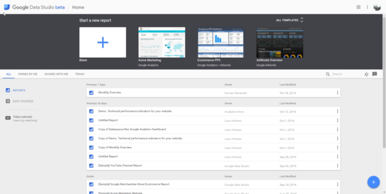
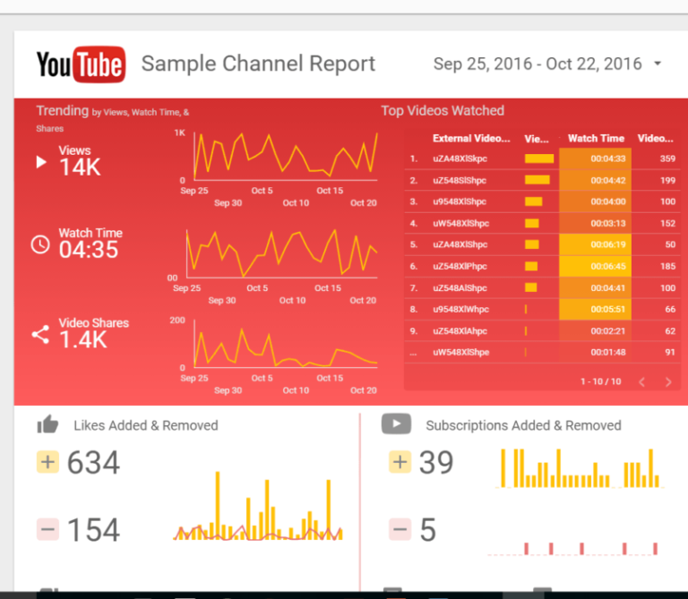
Out of the box, Data Studio has ready made templates which can be copied and customised.
Check out our free premade templates – Adwords Free Data Studio Template, and Google Analytics Data Studio Template. We shall add more as we build them. (e.g. YouTube, Facebook ads, Facebook ads etc). The Google Analytics one is 25 pages, and our Adwords one is 10 pages.
Data connectors
These are out of the box templates for integrating data sources with Google Data Studio
AdWords connector
Attribution 360 connector
Google Analytics connector
Google Cloud SQL connector
BigQuery connector
Google Sheets connector
MySQL Connector
YouTube Analytics connector
Templates for Google Data Studio
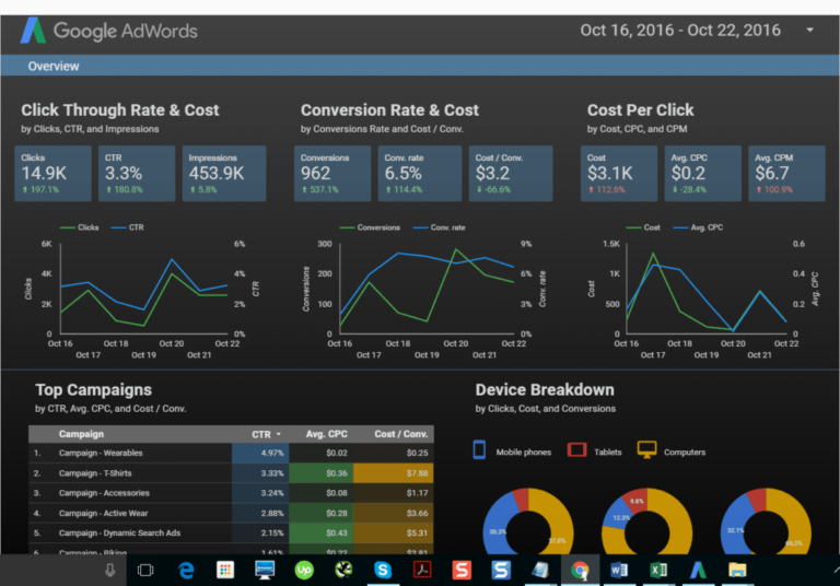
Google have built some pre-made templates that can be shared and customised, by adding more pages or changing the widgets. This is an Overview of Adwords Performance.
Google Data Studio lets you turn your analytics data visual reports through data integration using bar graphs, charts, line graphs and more. Google Sheets that store data such as Facebook Ads or Facebook can also be pulled into Google Data Studio.
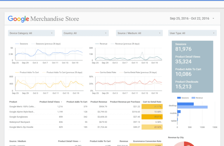
This is an e-commerce dashboard template.
Google Video introduction to Data Studio.
Check out our premade templates – Adwords Free Data Studio Template, and Google Analytics Data Studio Template.
Summary
Google Data Studio is an amazing reporting tool that can connect with multiple data sources, with an ever increasing list. The free edition of Datastudio has most of the features that the paid edition has. The integration with various Google products such as Google Ads, Google Analytics, Youtube, Google Search Console and more are out of the box solutions. The community platform is an ever growing community of connectors where datasets can be created that are compatible with the GDS format. Data mixing of multiple datasets is the latest advancement which will continue to get better.
